

So one painfully obvious terrain feature that I’ve never implemented is stained glass. I’d love to think that I’m the creative sort that pioneered the idea, but that’s obviously not the case. Heck, Dwez over at 40k addict did something with stained glass just last year, so perhaps part of my subconscious was just trying to emulate some of his work?
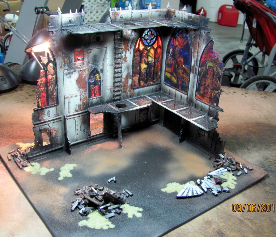
But I’d like to think that it’s been a thought of mine for much longer than a year. I know that GW used to sell a kit called the Chapel of Sanctity (you can see pictures over at Grailslair) which had stained glass incorporated into the piece directly. Realistically, GW’s “grim dark” feel certainly lends itself to stained glass, and nowhere is that more evident than in the Shrine of the Aquila terrain kit.
 Those massive windows just scream for stained glass behind them. And again, I’m not the first to think of that—there are several links to people that have tried to create the effect to varying degrees of success (including some amazing stained glass window art by Rlyons. I really wanted to steal a template from someone, but try as I might, I couldn’t seem to find one, and though I wanted to use existing art, the best stuff (including Rlyon’s work) wasn’t the right form factor for these particular windows and looked a bit misshapen when I distorted it to fit. Alas, this meant that I was going to have to create my own.
But how do you create stained glass? That was my dilemma. Obviously, I wasn’t going to make actual stained glass, and printing on paper might make pretty art, but it wouldn’t give me that feel of translucent glass. I wound up searching for transparency paper online, but I had trouble finding paper that would work with the high quality printers we have at work (and didn’t want to settle for inkjet quality from home). So, I wound up calling the local Canon dealer in town, as my office’s copiers are all canons and found out that they do make a special transparency that works specifically in Canon photocopiers. Apparently, the additional heat involved in laser printing requires special plastic so that it doesn’t warp and melt inside the machine.
 Good to know.
The good news is that it was just $.60 per page, but the bad news is that it’s sold in bundles of 100. Frankly, I can’t envision doing enough windows to justify $60 in pages, so I looked for other solutions online, and found a vendor selling one on Amazon for $15 (shipped). While I’m a big fan of buying local, I just can’t justify leaving that much money on the table, so I bit the bullet and ordered online.
When the packet came, they were surprisingly thin (I had hoped for something much thicker/sturdier, but apparently transparencies for Canons only come in one size. While I could’ve bought print-on stickers and then adhered it to some sort of vellum, I thought this would wind up being the better long term solution.
So, now I had an idea, and the “paper,” but just not the artwork.
That left me to scrounge Google for some nice stained glass. Naturally, if you do a search on Google images for stained glass, you’ll come up with a lot of great content, but most of it is the wrong content and all of it is sized wrong. As a side note, it did turn up this fantastic Sisters-of-Battle-esque costume of a woman covered in stained glass. But, I didn’t find anything that was specifically suited to my needs, which meant that I was going to actually have to do work.
Now, I consider myself mildly artistic (some might even say “high functioning artistic”), but I don’t consider myself an artist. I recognize that I have a natural aptitude towards art, and when compared with an average Joe, one might say I’m pretty good—but I don’t think I’m good enough to actually make a living at it. So, while I knew that I could draw something if I had to, I didn’t really want to go through the effort and besides, I was under a bit of a time crunch to get the terrain done for the (then) upcoming Apoc game.
So that begs the question: where do you get a piece of stained glass if it doesn’t already exist and you don’t want to draw it yourself? The answer was simple: figure out how to convert existing art to look like stained glass.
Back to Google, this time to search how to convert existing images to look like stained glass.
At first, I was happy to see that photoshop has an innate filter called “stained glass,” but sadly that just breaks the image into a bunch of like-sized shapes with black outlines. In effect, it pixelates the drawing in very similarly sized shapes, and doesn’t look very convincing to me.
 Next, I dug a little deeper and found a couple of articles that helped me get to my final result. The first was a page from Digital Arts Online that tried to convert an image of mushrooms into stained glass. He did pretty good work, but even the end result doesn’t really look like stained glass to me. I’m not sure if that’s the colors used in the image, or just the way he drew his lines (stained glass rarely has curved pieces as they’re much harder to cut, and his lines are very organic and not straight like we’re used to seeing). I did wind up using the Gaussian Blur option a bit in my final art though, as well as the fundamental concept of black-lining, and I wanted to preserve the link for others that might take more from this particular article than I.
By the way, I should’ve mentioned this earlier, but I had zero photoshop experience when I started this. I wound up getting a trial from a friend to work on this. Because of my lack of experience, many of the non-challant references in the previous article sailed above my head. Perhaps that’s why I didn’t take all that much from it?
The “article” that really helped me was actually this youtube video. Granted, he was using abstract lines to make this work, so you can basically skip the first minute of the video.
After he gets his baseline, at 1:16, he starts using some of the effects. The first he uses is one called “Poster Edges” (found under FILTER > ARTISTIC > POSTER EDGES. There are so many better articles online that delve into what this filter is and the subtle nuances behind it, but essentially, the filter seems to make things look a little more comic book like, making stronger/bolder lines between color variations.
The next trick he used is at 1:40 in the video where he uses a filter called “Oil Paint,” which is apparently a great fitler that comes packaged with Photoshop CS6. Unfortunately, I had CS5 so I had to dig around the interwebs to figure how how to install it for me. The good news is that it comes free with the Pixel Bender plugin for CS5 (And CS4 apparently) and can be downloaded from this page.
And that’s where the magic happened. The filter allows you to vary your brush stroke, intensity, etc. and for each graphic, I played around with the options so that it looked best for each picture. In short, no two settings were the same.
But I’m getting ahead of myself. Sure, I applied these filters, but to do that, I had to have art (and art that was the right size, too).
So what I did first was to make a rough size of each of the windows for the Shrine (well, one template for the larger windows and one for the smaller one), and then scanned them into my computer (I think I still have them somewhere if someone needs them, but then again, you can always steal my finished .PNG files if you just wanted to know the sizing).
 After that, I started looking for photos that would work nicely. My first pic was the battle between Uriel Ventris and a Tyranid Warrior (pictured at right). It looked suitably iconic, and fit the theme of Ultramarines and, best yet, it looked good after coloring it (for the record, I did wind up going through A LOT of photos that just didn’t look right after going through the effects, but I never found a simple litmus test to determine whether a photo would make a nice stained glass aside from actually going through the motions.
To recap, those motions were:
- Identify the photo. I wound up saving the photo and then placing it as a new layer in my drawing to get an idea of sizing, aspect ratio, and where the bars would line up on the image.
- Black-line the photo. In this step, I drew individual black lines all around the image to denote the edges of the pieces of glass. In general, I drew lines wherever there were distinct differences in color, and occasionally, extra lines if the “pieces of glass” were getting too big.
- Poster-Edge the drawing. This made the black lines stand out more and blended the other parts of the drawing a little bit extra.
- Oil-Paint the drawing. This essentially was the last step.
Another step that I wound up taking on more than one picture was to colorize parts of the image. You can see this is particularly true in the image of Roboute Guilliman (the ultramarine with “Mars” in the background). I found the art online, but then quickly learned that white was going to be a problem when printing on transparencies. This is because standard printers can’t print white (they don’t typically need to as they’re most often printing on white paper). The result is that any areas that are white in a drawing are simply left blank.
That’s fine and dandy on white paper, but on clear paper, “white” simply is transparent. To avoid this, I tried to clear out the white sections of drawings as much as possible. So, with the Roboute drawing, I wound up colorizing his shoulderpad and some of his trinkets to be more in line with the 2nd company (Which is the color of my army anyway). While I was monkeying around with the color anyway, I opted to change up the background as well. The background I wound up using was just a night sky, which distorted fantastically with the “oil paint” effect. And to break up the monotony, I positioned a red planet to line up with the center of the window. In hind sight, I almost wish I’d used a different plant so that I could use Mars with the techmarine drawing from later, but them’s the breaks.
With two Ultramarine Icons in place, I decided to use the Emperor as one of my other windows. The tricky part there was trying to find a suitable image of him that would translate well to the stained glass effect. Like the rest of the drawings, I started at a Google image search, but then I eventually dove into Deviant Art to find some selections. I wound up using a pretty generic picture for the window—after trying many other options. The background was rather plain, so I photoshopped in a picture of the eye of terror instead.
 The eye itself was a little amorphous and doesn’t lend itself to stark lines, but I think the end result worked out decently. There was a rather large blob of white in it that I tried to get rid of, but it just never looked right when I colorized it.
For the last big window, I just wound up searching based upon color. I’d already had predominately yellow, blue and purple windows, so I wanted another color from the other side of the spectrum. For this, I did some searches for green 40k artwork and came up with this. His background was rather short, so I wound up extending it and using that Gaussian blur filter to make it look right (keeping in mind that I didn’t have to make it look perfect, as the other effects I would be applying would help smooth the transitions. Granted, it was a bit busier of a piece, but I think it works. I wound up adding a thunderhawk to the sky to give it a little extra color, and a focal point for the circle at the top of the window (but I’d later cut it out almost completely from the finished piece).
With the last window, I wound up going with a Calgar picture that everyone probably knows by now. I went ahead and colorized his shoulders/buckle to be the old-school yellow and his “cinculum militaire” in a more purple scheme.
For those of you wondering, a cinculum militaire is his studded leather belt with the hanging leather strips. I know this because it was on some website I came up with when I searched for “Roman dangling leather.” I’ve used the internet to make me seem smarter than I am, and then immediately pulled back the curtain to ensure you know how dumb I really am.
But I digress…
So, after coming up with all of the images, I printed them on the transparency paper I’d purchased. The good news was that they came out looking rather well, but the bad news was that the paper looks different from either side. Like many photo paper, it had a glossy side and a dull side, and I preferred the glossy side. In addition, the colors look washed out on the transparency (which was due to the fact that the colors didn’t have that vibrant white background behind them).
At that point, I tried to come up with a solution to make the white stand out. My first attempt involved thinning down some white paint into a wash-like consistency and then painting that on the back of the window. It helped the colors pop tremendously, but the brush strokes stood out in the background. It should be noted that it wasn’t an altogether unpleasant effect though. The brush strokes gave some texture to the windows and might have passed for just part of the stained glass effect, but I kept trying.
Another test I tried was to simply print out two version of each window (with the images reversed on one). That would help me with the glossy/matt issue, and it ultimately wound up being the solution to the white issue as well. I guess the build-up of sheets of plastic (along with a coat of clear crafting glue to keep them stuck together) was enough to help make those clear areas appear white. You can get a good idea of this by looking at the pictures, particularly of the whites in Marneus Calgar’s photo and a bit in the Emperor’s Eye of Chaos background.
 So yeah, I wound up printing them out at full scale and gluing them together with some leftover craft glue from Michael’s. The important part here was to use glue that not only dries clear, but also goes on clear–that way I could properly line up both sides of the same image. I then let them dry by taping them up to a window in one of the last waning days of the Alaskan sunlight.
After they “dried” (and I use the term loosely because they still shifted relatively easily against each other), I cut them out with a pair of sharp scissors and then lined them up against the windows to see how they’d look. At that point, I toyed around with layout, deciding on the final window configuration based upon a series of factors including:
- Aesthetics of the figures next to each other
- The mix of colors featured in each window
- The position of each figure in the given window (knowing that I would be cutting some of the picture out of at least two windows)
Once I had that determined, I taped then in place with blue tape to confirm that it looked good, and when I was finally pleased with the layout, I set to cutting up the windows with an exacto blade so that they would appear broken. At first, I just did the two windows on the edges whose frames had clearly been broken, but I also wound up “breaking” all of the windows (except Calgar’s), by cutting spider-web patterned holes in them–though I kept those holes to a minimum, since my plan was to use this as a predominantly LoS blocking piece of terrain.
 As a final step, I took some of the scraps I had cut out and glued them around the floor beneath the window to make it a little more realistic and extend that “broken glass” effect into the rest of the model. It’s rather subtle (because it didn’t stick all that well to the plastic of the model, and I didn’t want it to prevent people from actually placing models).
I’m really pleased with the end result. I’ve gotten a few compliments on it as well, so that makes me think that my pride isn’t altogether unfounded. Hopefully my trials in this process can prove helpful to someone else that’s looking to incorporate some stained glass into their Warhammer 40,000 terrain project.
Oh, and if you’re interested in the original PNG files I was working with, I’m posting them below for your use. Feel free to use/change them as you want. If you’d like, you can thank me by linking to this post, but it’s not strictly necessary.
- Stained Glass Window – Uriel Ventris
- Stained Glass Window – Roboute Guilliman
- Stained Glass Window – The Emperor
- Stained Glass Window – Adeptus Mechanicus
- Stained Glass Window – Marneus Calgar (small)
As always, thanks for stopping by.

I…I don’t…wow. This is extremely well done and executed. What a transformation it has on the terrain piece. Your blog is fast becoming my go to spot for “stuff I should be doing to my terrain, because it looks mega awesome”
Thanks for not only showing us your great work, but telling how you did it!!!!
Thanks for the kind words. I do have a few more ideas for posts on terrain in the near future, but it’ll probably go dark after that. I’ve been sitting on some terrain projects for years and only finally got inspired to work on them. Now that they’re done, I’m going back and writing up some blog posts on them, so there should be 1-2 more about the buildings in the near future, and probably one on craters. For now that’s all that I can think of that I have in the queue. Perhaps I’ll have gotten off my arse and painted up the little barrels and drums by that point to use as filler on the table.
On Wed, Oct 15, 2014 at 7:42 AM, Warhammer 39,9999 wrote:
>
I feel like I have to point out that the pictures don’t do the finished piece justice. In person this effect is much more striking and makes for a great centerpiece.
I am waiting for someone to use a stained glass effect on the wings of a chaos heldrake’s.
These look fantastic! I’ve thought about painting onto printer transparencies but it never occurred to me to print the windows. This is very clever and well executed, and much better looking than my idea would have been!
I’m sure hand-painted windows would be amazing–I’m just too lazy for that sort of thing (and I don’t particularly care for my art style). So much easier to copy than to reinvent the wheel.
On Thu, Oct 16, 2014 at 9:39 AM, Warhammer 39,9999 wrote:
>
Awesome job. Those are very convincing. The colors look right, the style, it all came together amazingly.
Mahalo.
On Fri, Oct 17, 2014 at 7:07 AM, Warhammer 39,9999 wrote:
>
These are fantastic I struggled to dins something appropriate hence why I’ve used the image you referenced. I did find one guy who had done some stained glass windows I think for a video game texture, long tall ones, you might have seen them, they’re the first ones that come up in the google search. Anyway your tutorial shows a much better way to acheive the same effect, thanks for sharing.
Are you referring to ones by Rlyons for the “long tall ones?” (link below and in the original post). Those are gorgeous, but sadly, they didn’t squash/stretch to look right in the shrine.
Rlyons link: http://rlyonsart.blogspot.com/2013/05/warhammer-40k-stained-glass.html
On Tue, Oct 21, 2014 at 3:35 AM, Warhammer 39,9999 wrote:
>
Yeah, that’s the fella, amazing work
Some very inspiring work and giving it away free as well. I am still amazed at the super high quality of the work, well done 🙂
I appreciate the kind words.
On Fri, Nov 21, 2014 at 9:26 AM, Warhammer 39,9999 wrote:
>
Truely inspiring and thank you for sharing the source files. The end result looks very convincingand I would love to see a night shot with an LED behind the stained glass. 40kterminatus made me aware of your blog and it is a pitty a did not know about it earlier.
That’s very kind of you (and 40kterminatus). If you have any questions, please don’t hesitate to ask. While some people might view this all as competition, it doesn’t seem right to horde any of my successes (or failures, for that matter). Hopefully you can take the idea and improve upon it.
I totally see were you come from. It is the main reason why I share tutorials. My evil masterplan is to ban felt pieces from historical wargaming in providing easy to follow tuts :P.
Well, I’ve still a ways to go for that. I still use felt for forests. So, if you’ve got a suitable “easy to follow tut” for those, hook a brother up!
On Mon, Nov 24, 2014 at 5:52 PM, Warhammer 39,9999 wrote:
>
I have the trees covered, but the forest bases are still in the making ;). I actually thought about something using rare earth magnets, so you can use the base as brush. If storage is a problem chaulking on canvas with fallen leaves might be an idea. Earlier attempts had cut outs in them for the trees, but it is a trade-off, as you always see the seams. Might be time for some experiments.
Wow, fab blog I’ll have to look into giving this a go.
Thanks for the kind words. It’s always nice when someone new stumbles upon an old post and thinks enough of it to comment. 🙂
It’s fab. I’ve slowly painting some pre Hersey Emperor’s Children and I have based on self made temple bases so was looking how to make so broken stained glass. This looks ideal
One thing I’m not sure I clarified in the article that you’ll probably want to do is to ensure that you print out two copies (one inverted) and then glue them back to back. That really went a long way to increasing color quality on the finished product.
On Wed, May 18, 2016 at 7:06 AM, Warhammer 39,9999 wrote:
>
What glue would you recommend for that?
I don’t recall the specific brand off-hand, but it was something like this:
http://www.michaels.com/aleene's-clear-gel-tacky-glue/10312185.html
That might actually be the same stuff, though I seem to recall mine coming in a brown bottle–but the label looks awfully familiar. You want something that is going to go on clear and dry clear and that adheres to plastic. I suspect the stuff in the link would be perfect.
You Sir, are a legend
Hey!
Just a quick thanks for the guide and templates! I was certain I wanted to do stained glass windows on my shrine kit, and was just about to sit down to the long task of figuring out how to do it and making the art when I thought a quick Google search might help me plan it out.
Lo and behold, I find your excellent blog and templates! I followed your directions and they turned out amazing, so thought I’d pop by and give my thanks.
If you’re interested in my results, you can check them out in my gaming board album:
https://goo.gl/photos/mkieJQGuHGjCTxeg9
Thanks again. Whenever I post pictures of my minis I always try to take the time to let interested parties know how I did it, and write step by step tutorials if asked. This hobby is all about helping one another elevate our work, so it’s so nice to see these files available for everyone to download – it gives me so much pride to be a part of the community.
One more thank you!
Sorry for the delayed response. I had tried your link on my iPhone, but it didn’t seem to pull up any data, so I waited until I was back at a computer to check it again.
I’m glad I did, as your stuff looks fantastic. I like what you’ve done with the snow effects, and with the heavily weathered fences–I’d love to play on a table that looked like that. I also like what you did with the broken stained glass–particularly those pieces that have smashed on the ground. I tried to pull off a similar effect, but was less successful as I didn’t have the metal window frame on the ground too.
Thanks for letting me know how you did. Do you have a blog as well that I can post a link to for anyone else who might be looking for ideas?
Thank you! I was a bit so so on the chapel when it was painted, but the stained glass has really elevated it, and it’s now my favourite piece of terrain!
Unfortunately no blog at the moment. I’m a Warseer refugee, mainly active on Facebook and instagram (which is @miniature_lew if you’d like to link!). I’m sure I’ll start a blog at some point, but haven’t gotten around to it yet.
The frame on the floor is a bit from the Honoured Imperium boxed set. Through forgotten means I ended up with two floating around, so put them to good use! I always like my buildings to be as “complete” as possible, even if half of it is in a pile on the floor!
If you ever find yourself in England (the Southwest to be exact), fire me off an email and we can definitely get a game in!
Oh, using the honored imperium bits is brilliant. I never even bothered to paint those things up. I wonder if I can recall the paint scheme I used on that building now….
As for England, that sounds peachy. I don’t expect it’ll happen (at least not anytime soon), but I’m down. Have you looked up Dwez from http://www.40kaddict.uk? That’s a guy from your side of the pond that I’d love to get a game in with.
On Mon, Sep 26, 2016 at 8:48 AM, Warhammer 39,9999 wrote:
>